Revamp of Existing App
Elevating the user interface of Youtube
UX/UI Designer
Entertainment
2 weeks
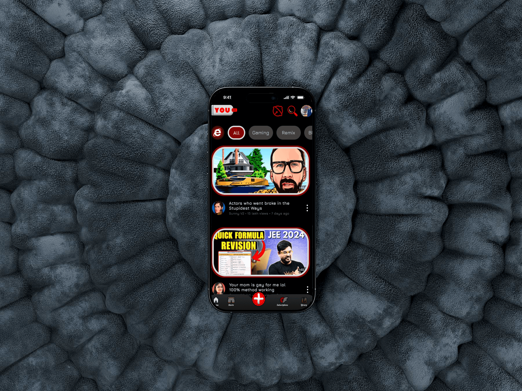
User Interface Redesign: Reviving Tactile Design with Modern Minimalism
Introduction
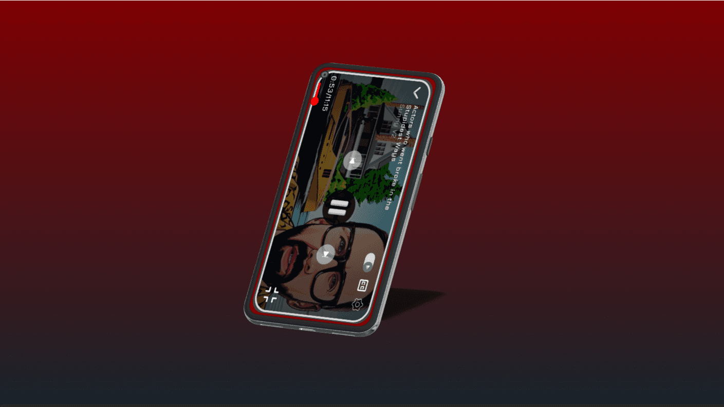
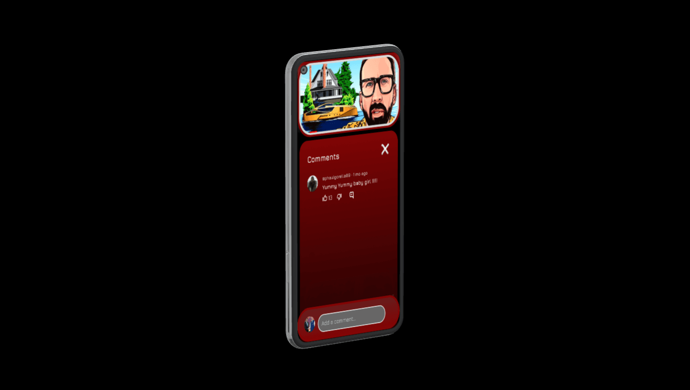
Our redesign transforms an outdated 2015-era app into a modern Skeuomorphic experience that balances retro mechanical aesthetics with a contemporary touch of simplicity. The app retains its iconic "tube with YOU" splash screen, now updated with refined red, black, and white accents, and a tactile, mechanical feel that prioritizes interaction and usability.
Redesign Objectives
Blend Skeuomorphism with Minimalism: Introduce tactile, mechanical design elements while avoiding visual clutter.
Focus on Interaction: Ensure every tap, press, and swipe feels intentional and responsive, mimicking the physical world.
A Familiar Yet Unique Aesthetic: Modernize the interface while preserving its original red-black-white identity, making it recognizable and appealing.
Redesign Process
1. Research & Insights
User Expectations: Users crave visually rich interfaces that evoke physical interactions but are not overwhelming.
Design Inspirations: Minimalist Sci-Fi visuals from Ex Machina and Oblivion inspired clean lines, glowing highlights, and a subdued mechanical aesthetic.
Feedback Analysis: Surveys highlighted a need for an app that felt alive and tactile without sacrificing modern usability standards.
2. Ideation & Planning
Color Palette: Enhanced the original red, black, and white colors with subtle gradients and glowing edges to add depth and focus.
Typography: Selected a clean sans-serif font with subtle mechanical detailing to complement the design theme.
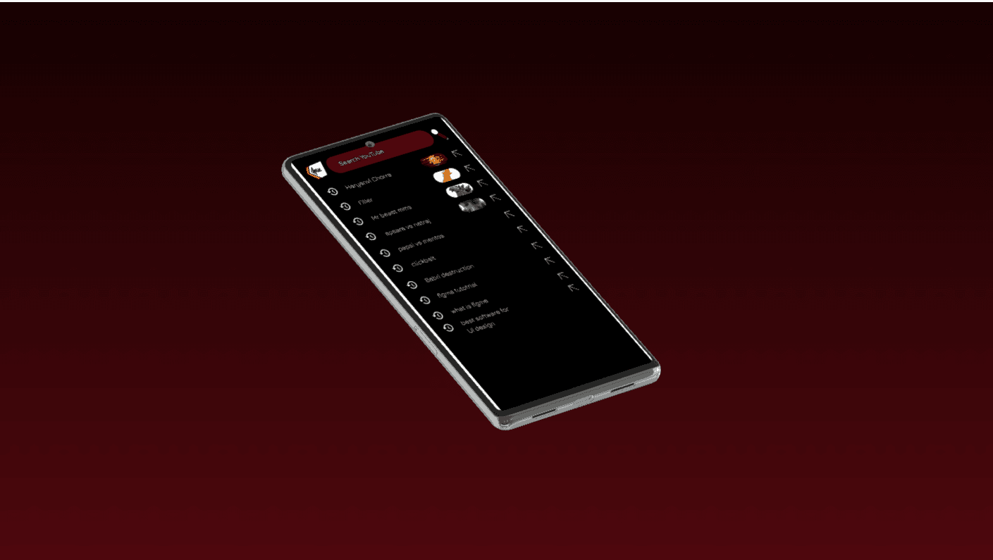
Layout Concepts: Focused on simple, grid-based layouts with mechanical elements like toggles, sliders, and analog-style buttons.
3. Prototyping & Wireframing
Wireframes: Outlined a visually restrained design with layered elements that give a tactile impression.
Interactive Mockups: Prototyped fluid interactions, ensuring buttons and sliders felt mechanical and responsive.
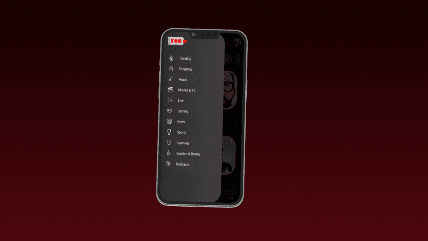
Visual Hierarchy: Established clear navigation paths, accentuated with glowing highlights and shaded layers for depth.
4. Visual Design & Animation
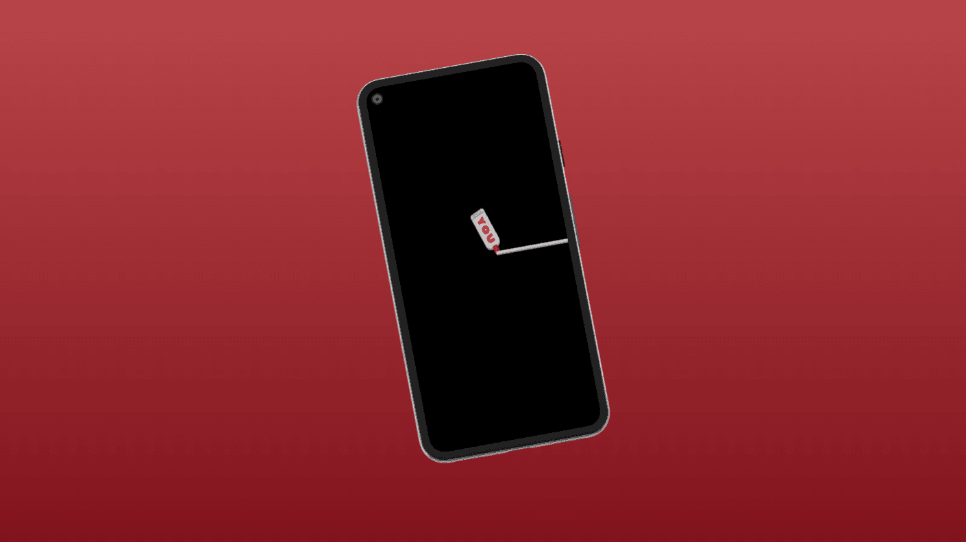
Splash Screen: The YOU tube design is now sleeker, with glowing edges and smooth animations that emphasize the brand identity.
Buttons & Controls: Each element appears mechanical, with slight shading and haptic-inspired animations to mimic real-world interactions.
Tactile Feedback: Simulated pressable buttons and sliding controls with depth and shadow for an interactive feel.
Subtle Animations: Introduced smooth transitions and hover effects to guide user interactions without overwhelming the design.
5. Testing & Refinement
User Testing: Feedback confirmed that the tactile design created an engaging and intuitive user experience.
Accessibility Improvements: Added high-contrast modes and descriptive text for all interactive elements.
Performance Optimization: Streamlined animations and transitions to ensure a fast and responsive experience across devices.
Key Features of the New Design
Updated Splash Screen: The tube with YOU now glows subtly, setting a sleek and futuristic tone.
Tactile Interactions: Buttons, sliders, and toggles feel like physical controls with mechanical animations.
Enhanced Visual Depth: Shading and layering create a restrained Skeuomorphic look that feels interactive and modern.
Minimalist Sci-Fi Aesthetic: Clean lines, glowing accents, and a subdued mechanical feel create a visually rich but uncluttered experience.
Responsive Feedback: Every action provides subtle visual and haptic feedback, enhancing the sense of control.
Red-Black-White Theme: Retained and refined for consistency and brand identity.
Conclusion
This redesign redefines the app’s identity, offering a modern Skeuomorphic experience that balances tactile richness with contemporary simplicity. By giving users an interface that feels alive and mechanical yet uncluttered, we’ve created a design that is not only visually engaging but also intuitive and practical.